A Contrast-Focused Color Picker
By Tomi Chen April 10, 2022
Choosing colors with good contrast is a critical part of accessible design in all formats and mediums. However, it can be difficult to pick these colors with tooling that wasn’t created with contrast in mind.
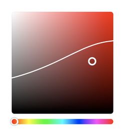
I’ve always wanted to have a color picker that would visually display which colors had sufficient contrast against a base color, but couldn’t find any existing tools that had this feature. Ideally, this would be an otherwise normal HSV color picker, but with a line drawn at the contrast threshold. So I built it myself!

How do you calculate color contrast?
The standard for web content accessibility is the WCAG, or the Web Content Accessibility Guidelines, which require a minimum contrast ratio of 4.5:1 with 7:1 required in certain situations.
To compute color contrast, WCAG 2 uses a luminosity-based algorithm. Where do these numbers come from? Who knows! Color and color perception is a super weird and complex thing, and I have gone down Wikipedia rabbit holes and come out more confused than I started with.

Let’s all just thank the W3C for giving us this algorithm and move on with our lives.
Color Formats
But wait! We’re not finished with this color nonsense yet! The WCAG 2 algorithm uses RGB values, but our color picker uses HSV (aka HSB, not to be confused with HSL). We have to first figure out how to convert from HSV to RGB, which we can then plug into the contrast algorithm. Luckily for us, Wikipedia tells us exactly how to do that!
Prototyping in Desmos
To figure out if this will even work, I decided to make a quick prototype in Desmos, a free online graphing calculator.

The Desmos prototype just involved slapping all the algorithms in there and importing an image of a gradient. Hue is adjustable, as well as the color to contrast against. It worked!
This prototype allowed me to check against it when building the actual thing, making sure things worked properly and letting me play with certain parameters.
Actually making the thing
That’s enough screwing around, it’s now time to put this plan into action. The first thing I did (tbh even before all that color research) was to try building my own vanilla color picker. While I could probably have used a pre-built component, I thought it would be easier to add the contrast boundary if I made it myself.
I was initially a little daunted by the task but decided to see how other people have built color pickers for inspiration. I discovered that essentially, the picker is just a <div> with a gradient background and another <div> absolutely positioned inside as the cursor. Javascript is used to make things interactive and work properly.
Since this was going to be a utility in my personal tools site built using SvelteKit, I could build the picker using Svelte, which made things super easy. While I’m not sure how accessible my implementation is, I did make it keyboard usable. If you’re interested in the details, the code is open-source on GitHub.
Computing the points
While making a color picker is all good and fun, the interesting part about this project is computing and drawing the line on the color picker. My initial idea was to sort-of brute force search for valid points, then use an SVG to connect the dots. Using brute force didn’t seem very elegant to me, but after discussing it with some friends I decided to go with it anyway, since I couldn’t find any other alternatives. Luckily, the boundary lines are pretty smooth and don’t require too high of a resolution.
The brute force method sweeps across the x-axis (saturation), going through the y-axis (brightness) for each x to find the two points where one point passes the contrast check and the other does not. I tried some other methods, but it turns out that this brute-force method was the most stable. I fine-tuned the search intervals to strike a balance between speed and accuracy.
Additional logic was added later to handle the case with two boundary lines (where the contrasting color was not black or white). This was done by checking if two points have been found, and splitting the top point into one line and the bottom point into another. If two lines are being generated but only one point is found, we compute the distance between the found point and the end of the generated lines, placing the point into the closer line. This method worked surprisingly well.
Rendering the line
Now we have a list of points, it’s time to render the line. I wanted the line to be smooth, with as few bumps or corners as possible. SVG can render cubic Béziers, but how do you find the control points?
A StackOverflow answer referenced Catmull-Rom splines, but it felt a little overkill considering the lines should be fairly smooth. More searching revealed a Medium article on smoothing SVG paths that looked promising, so I modified their code to fit my purpose.
Conclusion
Wow! Through this project, I learned a lot about color algorithms, unlocked Desmos as another tool for prototyping, and realized that keeping things simple might sometimes be the best solution.
Feel free to check out the final product, and let me know what you think! I’d love to hear any feedback you have.