Redesigning SciOlyID: My process for building websites
By Tomi Chen January 18, 2022

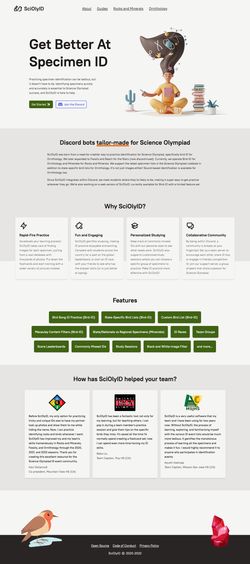
I recently did a redesign and rewrite of the SciOlyID website, available at sciolyid.org. SciOlyID is a group of Discord bots and other services to help students practice specimen identification. It started as just a summer project by my friend and me, and it has since grown into the largest project I’ve ever worked on.
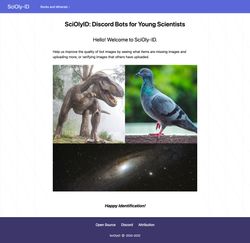
The previous website primarily provided an interface for uploading and verifying images for Fossil-ID and Star-ID (now discontinued). The website wasn’t designed to be informational, with a hastily thrown together homepage and a generic theme.
I had always wanted to refresh the website with a sexy landing page and comprehensive documentation but wasn’t motivated to do so. However, after discussions about a possible partnership with the 2022 Science Olympiad National Tournament, I knew that the website would not cut it.
This post will outline my process for building and designing websites, from planning to production. As always, I aim to build performant, accessible websites that fulfill a purpose to the best of my ability, so accessibility and performance are factors in every decision I make.
Structure
Whenever I work on a project, I need to understand the scope and requirements. After that’s established, I can start planning the site’s structure.
When I say “structure”, I include the technical details and the content structure. In this case, the site would require static pages for documentation and guides, with interactive pages for online ID practice and image verification. These requirements made SvelteKit a clear choice for this project since I’ve used it in the past and enjoyed it quite a bit. SvelteKit allows me to prerender static pages for better performance and use Svelte to build interactive components, which is lightweight and easy to use.
For content structure, I started by considering the landing page. Since the landing page has a unique design compared to other pages, I wrote out all the marketing copy beforehand. I brainstormed ideas by asking how SciOlyID is different (and better) than other options, listing the features we support and the various sections I wanted to add. I also brainstormed different hero title ideas. During this process, I looked at other landing page designs for inspiration.
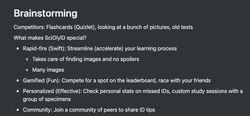
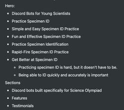
Armed with the brainstorming session results, I could combine everything into a final document for the textual content of the landing page.
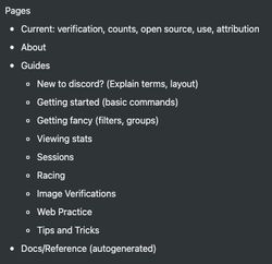
After completing the landing page, I created a list of all the other pages that should exist. This included existing pages that needed to be ported over and new pages to write.
Functionality
With the structure planned out, it’s now time for the implementation. I laid out the page structure in this stage, creating empty routes to be filled in later. I then worked through page by page, adding the necessary content and functionality. I usually like to start with the more straightforward pages to get them out of the way, then move on to the more complex ones. This is up to personal preference, though.
There’s not much else to say here except that Svelte is a joy to work with. Even if the compiled output is much larger than the vanilla counterpart, it’s still lightweight enough (especially compared to other frameworks). The developer-facing code is also smaller and easier to understand.
For content-heavy pages, I decided to use mdsvex to allow content to be written in markdown. Using mdsvex with SvelteKit is super easy: use the svelte-add adder for mdsvex, and .md files in src/routes automatically become pages.
Design
While I could probably have done the styling in vanilla CSS, I decided to use Tailwind for their typography plugin and the color palette. The old SciOlyID site was also styled with Tailwind, allowing me to copy/paste some styles.
For the navbar with mobile styles, I followed a guide from Ben Holmes with some slight modifications. I disabled scrolling when the nav menu is open and modified the background opacity based on whether the browser supports backdrop blur. On wider screens, nested nav menus are click menus instead of hover menus.
Since I wouldn’t consider myself a designer, I browsed sites like Dribbble and Tailwind UI to inspire the landing page. For illustrations, I found some online that were free to use with attribution. I decided to go with a simple warm gray color scheme that matched the graphics pretty well.
Even though design can be a rough spot at times, I’ve found that there can be actionable tips to keep in mind that can help make designs look that much better. The free resources from Refactoring UI are helpful tips, as well as general advice from Josh W. Comeau’s blog and his CSS course.
Tweaking
Now that everything’s built, we’re done, right? Not quite. There are a lot of little things to tweak here and there. My checklist of things to do before production are:
- Fonts
- Error Pages
- Favicon
- Social Cards
- Lighthouse
I drew the logo and favicon myself in the Scratch vector editor (lol). I want to eventually learn how to use a “proper” vector editor like Inkscape, but Scratch is straightforward and has (almost) everything I needed. The alignment is eyeballed, but it shouldn’t be too noticeable at the small sizes of a favicon. I referenced some other logo designs for inspiration.
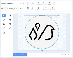

You can use any of the many favicon generators online to create the appropriate files.
Feedback from family and friends was also good, especially if you can watch someone try to use the website. This will help you figure out if the flow makes sense.
Conclusion
I hope this peek into my process for frontend web development was helpful, or at least a little interesting. Remember that this is how I approach things, which may be different from others. I’m also constantly evolving my process to find what works and what doesn’t.
